Designing the Terminal for Color Accessibility
October 19, 2021
We often think we see user interfaces the same way as everyone else. However, for users with color vision deficiencies, certain color combinations can have detrimental effects on their use of the Bloomberg Terminal. We estimate that 20,000 of our users have Color Vision Deficiency (CVD), and we must not overlook their needs as we design and roll out new interfaces.
What is Color Vision Deficiency?
Some people know it as ‘color blindness,’ but that is actually a misnomer, since people who have CVD aren’t necessarily ‘blind’ to colors. Rather, they have a deficiency in which one or more cone cells in their retinas (the cells that detect colors) have reduced or no sensitivity to specific wavelengths of light (Image 1).
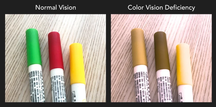

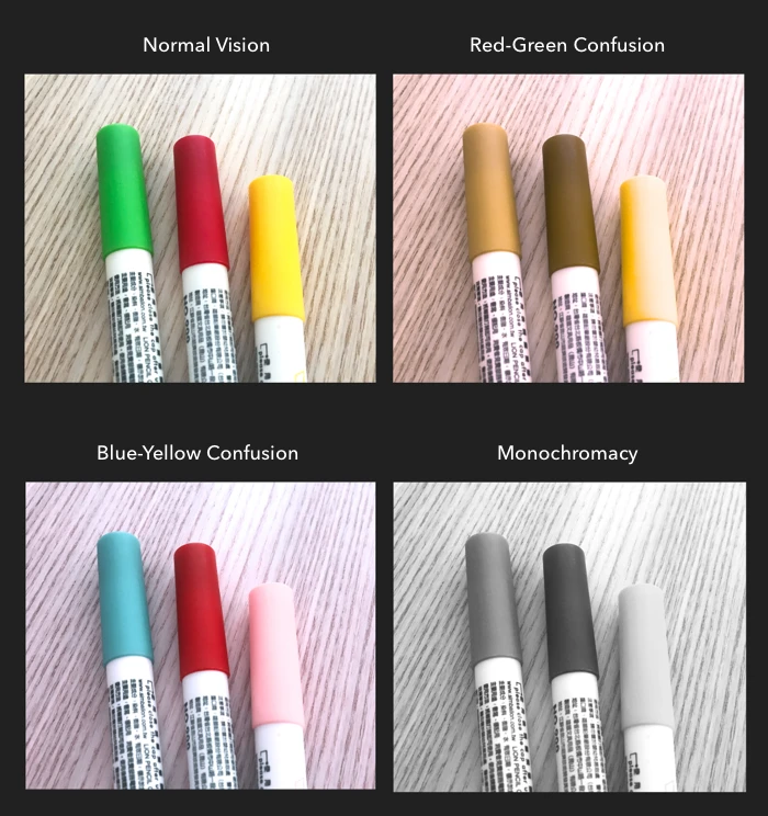
The scientific terms are dichromacy (a type of color deficiency where one cone cell is completely absent – for example, if the green cone cell is absent, it is called Deuteranopia) and anomalous trichromacy (a type of color deficiency where one cone cell has a reduced sensitivity to certain wavelengths of light – for example, having reduced sensitivity to green light is called Deuteranomaly). These color vision deficiencies can take many forms (Image 2). The most common form of CVD affects the red and green wavelengths of the color spectrum.
This deficiency certainly affects people’s everyday experiences. Imagine not knowing if your clothing matches, accidentally eating unripened (green) bananas, or being unable to tell one sporting team’s jersey from another when watching a game on TV.

There are varying prevalence rates of CVD across ethnicities (due to its genetic component) and genders (with CVD predominantly affecting males). However, even by conservative estimates, 20,000 or more of our Terminal users could have the most common form of CVD, Red-Green.
Why is this an issue for our product?
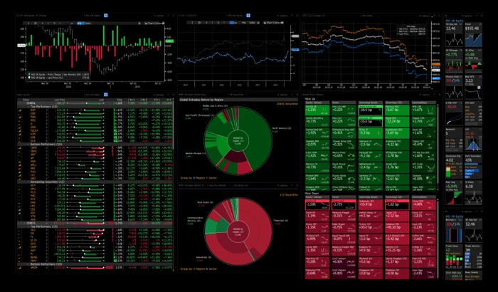
In the financial industry, red and green are key visual indicators, because they express positive and negative semantic meanings in Western conventions (Image 3). For example, green generally indicates an “up” market status, while red generally indicates a “down” market status.

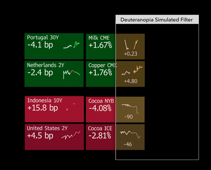

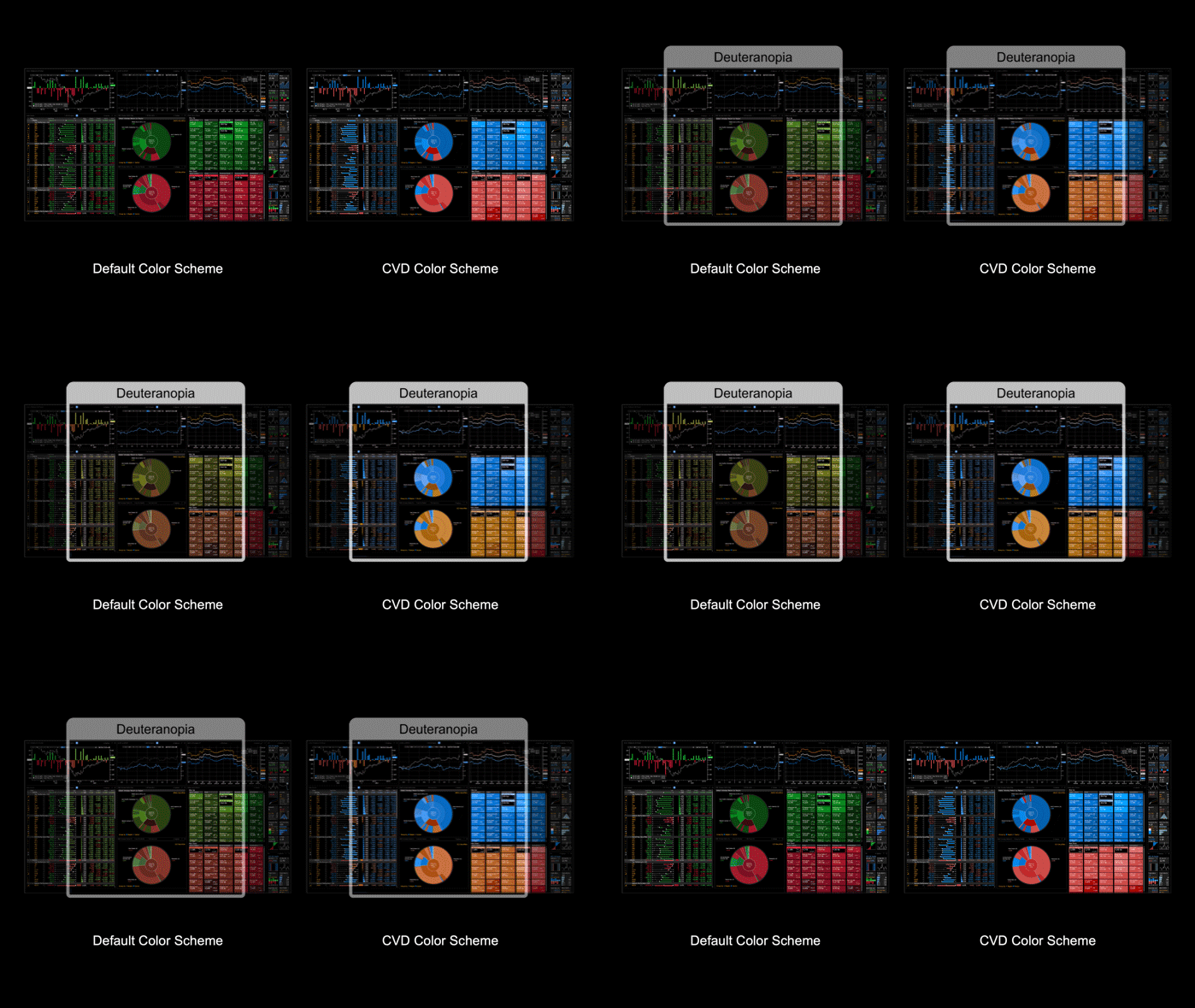
Software programs can simulate the approximate colors that a person with CVD might see. Using this CVD simulator (as shown in Image 4), we can see what an example from the Terminal looks like from the perspective of a user with Deuteranopia. While there still are individual differences between different people, it’s clear that these reds and greens are difficult for these users to distinguish.
This could potentially have large financial repercussions, when using our system to make a decision to trade millions of dollars of securities could be affected by these important visual indicators.
What about other products?
Operating systems, such as Microsoft Windows or Apple macOS, have enhanced contrast or increased text legibility support to aid in accessibility. These settings cater to a more general approach in an attempt to cover multiple types of vision deficiencies. Apple iOS also includes a small set of preset colors that can be selected for specific CVD types, but this has disadvantages in that it changes specific colors that are crucial in the financial industry. Because of this, we needed to take a researched approach to make our product more inclusive.
Our research process
To better understand how to implement CVD themes in the Bloomberg Terminal, we first needed to evaluate the user experience of our clients with CVD.
Once we found clients who had self-reported CVD, our next step was to assess which type of CVD they had, and how mild or severe it was. We did this by administering the Ishihara test for color deficiency, a well-known color differentiation test, over the internet.
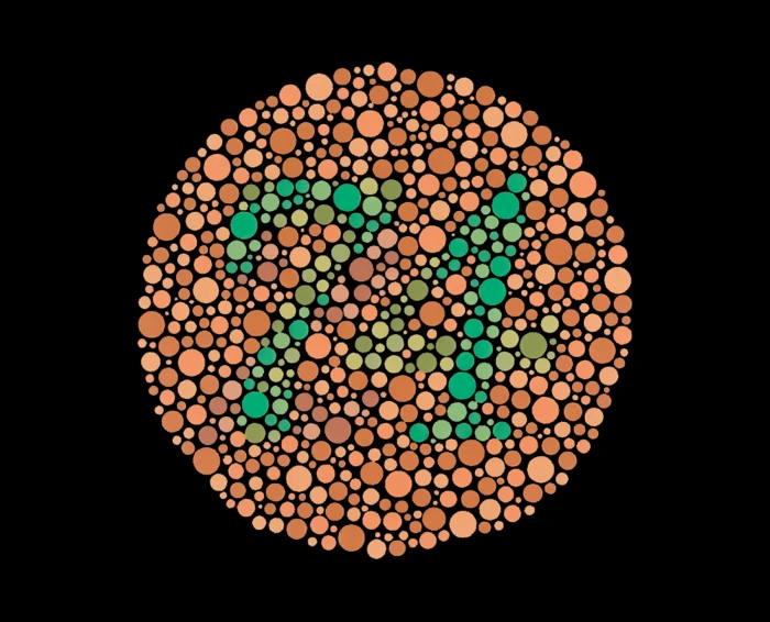

It’s important to note that this color differentiation test is not perfect, and that test results can vary from what users initially report. To understand how CVD affects the Terminal user experience, we invited these clients into our usability lab and had them evaluate a series of different Terminal image types (e.g., graph lines, colored text, buttons, bars, and heat maps). Clients’ task performance was measured, in addition to self-reported confidence scores of their performance, and overall preferences. Linear mixed effects model analyses showed statistically significant differences between the different color sets, such that clients were more accurate, reported greater confidence, and preferred the alternative and high contrast color sets compared to the current color set.
We concluded from this study that clients with CVD can distinguish alternative or high contrast colors on the Terminal better than the current color set.
Once we understood that certain color sets affected our clients’ task performance and confidence, we wondered, “Which colors would make the Terminal easier to use for clients with CVD?” To answer this question, we needed to go outside the usability lab and interview clients at their own desks to understand how their perceptions of Terminal colors are influenced by the context of their environments.
We interviewed clients using the same image types we evaluated in the previous study. However, this research differed from the previous study in that we enabled clients to run several alternative and high contrast color sets on functions within their Terminal windows, and to provide feedback on these alternative and high contrast color sets in real-time, and in their actual work environments.
Based on this feedback, we found that clients’ perceptions of Terminal colors were affected by how mild or severe their CVD was. For instance, those who had a milder form of CVD tended to have fewer issues differentiating colors, but did have minor issues with differentiating between thinner red and green lines.
Those who had moderate CVD experienced more difficulties with colored images, particularly those with reds and greens blending together. They also had more difficulty distinguishing between darker colors on dark backgrounds.
Finally, those with severe CVD had issues differentiating between different hues of colors like yellows, purples, pinks – in addition to standard greens and reds.
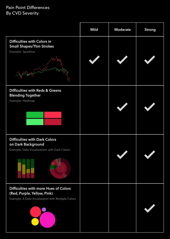

Our research also uncovered that some colors had different meanings in different contexts.
While users with CVD may have trouble distinguishing between different color combinations, their semantic color associations persisted. For example, greens and blues tended to be self-reported as denoting an “up” market status, while reds, yellows, and oranges tended to denote a “down” market status.
Our solution
Once we gathered these learnings, we knew that our design solutions needed to be:
- Associated with the implicit “semantic” color meanings users were already familiar with
- Brighter and more saturated to aid users who had more severe forms of CVD
- Consistent among the Bloomberg Terminal user base with CVD
Based on these insights, we introduced the following new CVD color schemes for the Bloomberg Terminal.
Users with Deuteranopia now have the option to view their Terminal screens using semantic colors other than reds and greens for positive and negative sentiment.
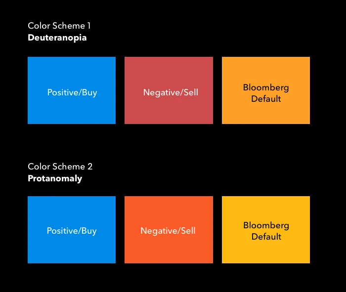

Based on our research, we chose to stick with a blue and red (“up” market status and “down” market status) CVD color scheme, while at the same time retaining the default Bloomberg amber color for non-semantic information. This color scheme incorporated our research findings, while also retaining the tradition and legacy of other well-known colors associated with the Terminal.
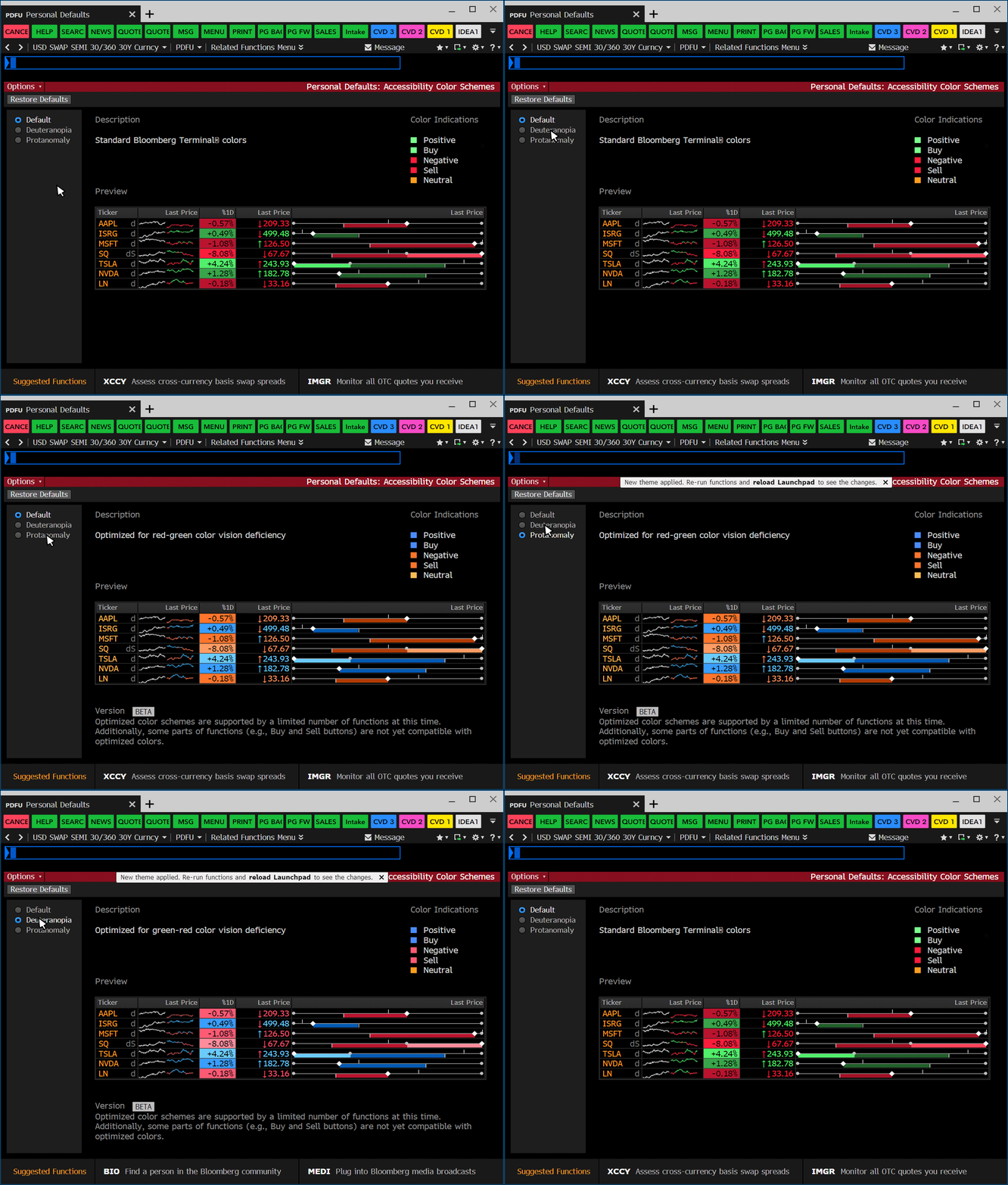

But, we weren’t done yet! In addition to the initial focus on Deuteranopia, we also implemented a second CVD color scheme specific to Protanomaly, another rare type of CVD.
RELATED RESOURCES
{PDFU COLORS <GO>}
To turn on one of these new color schemes, users can change their default color scheme settings using {PDFU COLORS <GO>}. These color schemes are applied immediately after the option is selected and is re-run within the panel window.
To illustrate how these new CVD color schemes might look to a user with this specific deficiency, we’ve demonstrated the effect when we put the default red and green colors side-by-side to the redesigned CVD color scheme and look at them through a CVD simulator.

Initial feedback on these new color schemes has been positive. Here are a few quotes from some Terminal users:
- “I noticed that there is a deuteranopia colour option in PDFU. This is very helpful for me…”
- “I want to send {PDFU COLORS <GO>} to a colleague…”
- “This is very cool and very helpful…I just made a nice change for myself…”
There’s even more to look forward to
As is often the case with technological improvements, the work we have done to get us to this point has inspired and enabled us to think about — and to work on — further improvements to the Terminal. We look forward to sharing them with you as they become available.
Want to learn more about the work of Bloomberg’s UX team. Come chat with us at Clarity Design Systems Conference 2021 (October 27-29, 2021) or check out our open roles.